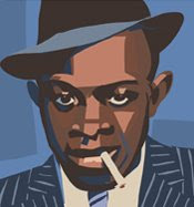
The image above is in the latest issue, which also features a wonderful comic strip by Dan McDaid and Sean Longcroft, plus regular art joys from Ade Salmon and Ben Wilshire.
I used to do regular spots for the Guardian in a similar style. Here are a few examples, these all appeared in the Guardian Weekend magazine.


![[huzzahnoir2.jpg]](https://blogger.googleusercontent.com/img/b/R29vZ2xl/AVvXsEhfLdDLBBPfTSXRPWrnWAtBD0aOZCN-zriqioFPJjPJkoxY_aiXqD070FccoLIdFOmwjNgUsYhjDfS9Rby_Ma7JXa-i5imDIl2Ytku1_gMjs3jRgRlOJMALTP_pDI6ovoek8_Uhz-zi7Eum/s1600/huzzahnoir2.jpg)
5 comments:
Hi Rob
It's really good to see the non comic side of your work, I really like your Dr Who stuff despite the fact as a kid I hated the McCoy incarnation,out of interest how long does one of these pieces take you to do ?
Hated the McCoy incarnation? No ways!
I'd certainly like to go on record as really admiring your Who review pieces. Like your philosophy too in regard to being illustratively creative as against merely tracing a photo. Love *idea* based illustration - usually seen on covers or editorial pages. Hard as nuts to do well - it's all in the idea - and you've got some good examples here.
Oh and I prefer the Photoshop vector version since you asked - a bit grittier maybe , just ...:)
A
i'm with ade.
and the DALEK pic gives me a feeling it could've appeared in a 60's READERS DIGEST, a strong retro-illustration feel, with added CARTOON NETWORK stylization. and i love the movement and sweeping drama.
all these spot illos show you've an eagle-eye for composition and balance, same as in you comics, but i'm interested in which do you think fed the other?
my eyes are fucked, so i prefer both.
ps;see you over at HUZZAH!!
Thanks all.
James - they pay me a day and half's money so that's the longest I'd spend on one. Just finished a new one which took the whole day and a half, felt like torture after knocking out spot illos for a kids book in Manga Studio last week.
Ade - the photoshop version ends up a bit chunkier which I like but it's slower than Illustrator
Shane - short answer one feeds the other. Long answer is that I'm always looking to bring together the things I learnt from painting, action comic art, cartooning and illustration. I like skipping between all of them and love it when a discovery in one field opens up a new way of seeing things in another. There are short hands in cartooning that have opened my eyes to things about figure drawing and ideas from painting that have informed my approach to comics and so on...
I'll never reach a point of absolute synthesis but it's fun trying to get there
Post a Comment