Wednesday 29 December 2010

What shall we do in 2011?

Let's not, eh. It would be a waste of comics, and there is much comics to be made and much comics to be read over the next 12 months. My schedule is filled with Don Quixote until May when I'll take on a few other smaller projects before tucking into Quixote Vol. 2. I also have another project on the go that I'm acting as editor on. It was 'just an idea' a month ago and had anyone said:
that would have been the end of it. Someone didn't, in fact someone thought it was a good idea and now I'm committed to it. There will be announcement in a couple of months and you will all be duly excited. Unless you already know, in which case you'll probably say, "not that again...!"

That's the book making side of things, there is also the book reading side of things:

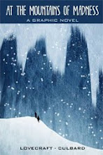
That's right, there will be books from me you can take home. There will be two books from SelfMadeHero that I've worked on out next year: Quixote Vol. 1 (of course) out in the Autumn and The Lovecraft Anthology, out in May, featuring The Dunwich Horror written by me and drawn by the irrepressible Ian Culbard.

It certainly is a strange tale, but then that's Lovecraft for you, he was a strange chap. The ear in question belongs to our friend Alonso Quixana.


Ouch!

All these illustrations, with the exception of Ian's, come from Don Quixote. The funny looking, green ones at the top are from the stories within stories that are a big feature of Quixote. No doubt I'll blog about that next year.

For now though I need to get my head down and draw. In that respect at least 2011 will be much the same as every other year.


Monday 27 December 2010

Inside Soap

Here are some of the soap cartoons I've done over the past year for Inside Soap magazine. If you don't watch soap operas this probably won't mean a lot to you. Actually I don't watch them myself but I'm always well briefed by my editor, Gary Gillat. Most of the images are his ideas.

These pics are vaguely in the right order and you can see the point where I tried something different (the axe one), Gary liked it so much we changed approach from there on and ended up with images that are more interesting and often quite surreal.

Monday 13 December 2010

Christmas Doctor Who!

December's Doctor Who Magazine is out in the shops today (or tomorrow depending on where you live). It contains a new comic strip written by Jonny Morris and drawn by me, called The Professor, The Queen and The Bookshop. Jonny and me have a good track record for bringing the best out in each other and this one certainly stretched me at times. I won't give away anything about the story, but both script and art are full of hidden treats.

The above image is page one sans lettering, the image below is from the last page.

I have to give a big thanks to Geraint Ford for his brilliant work on the colouring - painstaking flatting and ever patient with me and all my demands.

Friday 3 December 2010

Who Wrote Don Quixote?

Hang on! If this fella is translating Don Quixote, whose words
are in the caption? Or is that what he's writing?

There's much sleight of hand and obfuscation around the authorship of Don Quixote, not like the conspiracy theory stuff that surrounds Shakespeare, the deception in Don Quixote is Cervantes' own. It's one of the reasons why adapting this book is far from the hollow task that some adaptation presents. I've become bound up in the metafiction and realise as I go forward how often the tools of comic storytelling lend themselves well to the overlapping narratives that Cervantes created.

Look at this fellow, for example. He's the unnamed translator of most of the book, for all we know he could have made it up. We rely on him to give us the true origin of the book and name its true author:
It's that kind of book. One minute you're wrapped up the crazy adventures of the two hombres next minute the whole notion of fiction collapses around you and it's your own sanity that comes into question.

Deception is an art. Art is deception, and everyone connected with Don Quixote, including Cervantes, Don Quixote, Sancho Panza, me and you are part of that deception. This crazy old man wants to be like a knight-errant; knight-errants only exist in books; Don Quixote makes himself like a book; Don Quixote is a book; we make him real; Cervantes makes him real; he outlives Cervantes and you and me...

Maybe I've been overdoing the Night Nurse or maybe this book has got to me. OR... Maybe this book has to get to me otherwise I'll never pull off the deception.

Sunday 14 November 2010

Things to buy at Thought Bubble


Long post this one, and unusually it's mostly about other people's work. This weekend (all being well) I'll be at Thought Bubble comic con in Leeds and hopefully I'll see lots of you there. I will be selling posters and postcards and original art again, but this time from the Blank Slate table which will be at the end of the big ol' Forbidden Planet table. The only new addition to the posters I had for sale at BICS is the Solipsistic Pop 3 poster above. Here are the others:

If I'm not at the Blank Slate table you may find me at the Solipsistic Pop table helping give the Solipsistic Pop 3 book it's official launch. There's a long shot that I may be lurking around my own publisher's table because SelfMadeHero will be there with their increasingly excellent list of titles. I won't be adding to the list until next year, but my friend and inspiration Mr Ian Culbard will have his new adaptation of At The Mountains of Madness by HP Lovecraft on sale and will be sketching and signing at the event.

BUY \

Ian's adaptation is perhaps the best of his SelfMadeHero books. Here "Britain's answer to Darwyn Cooke" works in double page spreads and uses the broader space to give us snowy vistas, frozen oceans, alien cityscapes and vast mountain ranges. The writing is stripped down and the book zips by, in stark contrast to the heavy going Lovecraft texts. All is rendered in Ian's trademark style, a kind of Yves Chaland/Frank Robbins lovechild.
As I know from struggling through my adaptation of The Dunwich Horror (which Ian has drawn and, in my opinion, is his best strip work yet!), voice overs are pretty inevitable in Lovecraft comic adaptations. Here the best sequences are where Ian shakes off the voice over and lets the characters play off one another or the action move seamlessly. If I have any criticism of the book, it's really a criticism of the source material - and that's the characterisation. I didn't really care about them. Lovecraft's characters are flat; he's all about ideas and the characters too often become cyphers. What Lovecraft excels at is spiking the imagination with his poison and enveloping the reader with a sense of menace beyond our ken. Ian's version loses non of that. You won't buy a better Graphic Novel or comic at Thought Bubble, don't hesitate to get it.

So when you've got you Solipsistic Pop 3, some of my posters and At The Mountains of Madness what else can you spend your pennies on....? Well, seeing as you'll be standing at the Blank Slate table I suggest you buy as many of their books as you can because I can't think of a comic publisher with a higher hit rate. All things going to plan I will be adding to their list with something of my own, something I'm so excited about I need to move on before I blurt. What there will be on the table is the standard Blank Slate excellence in the shape of Oliver East's books (Oliver's work is truly unique, check it out), Psychiatric Tales by Darryl Cunningham (the comic book that even mum's love!), books by the brilliant Mawil and the hilarious Speenal by Nigel Auchterlounie, (check them all out here) plus the two newest editions: Sleepyheads by Randall.C and The Girl and the Gorilla by Madeliene Flores. Buy both!

Image of Sleepyheads - Randall C. - Hardcover Version

Sleepyheads is a quite beautiful object. It's drawn in a style I instantly fell in love with: flat, tattered, desaturated colour swatches for panels and wonderfully realised characters scrawled across the pages with deceptive ease. I could eat a book like this. The question is would the story match up? Well, a story about dreams with characters strolling from one dreamscape to the next could have been a real let down - how do you relate to characters in a story like this? Why should you care what happens when you know that it will end with every kid's favourite first story ending "then I woke up and it was all a dream"?
By coincidence I read this at the same time I was reading Sleepyheads. Any comic about dreams will always make me think of Little Nemo and Bill Watterson's comments ("I can’t read the strip without thinking how much more enchanting Slumberland would be if the characters, rather than the backdrops and costumes, advanced the story") in that piece had me questioning what made Nemo work for me. The answer is that sometimes a comic or book just has a feeling to it that you can only reach via reading that piece of work. Perhaps we shouldn't let our tastes and biases make demands upon what comics should be, they're still in their infancy I think, we don't know that answer.
So back to Sleepyheads, what does it offer? Well, strangely enough it offers more than most comic books I've read this year. The dream logic means the strip morphs from one thing to the next, but there is a real structure as the story flits between the two characters trapped in a dream and two Russian sailors stuck on a desert island. The book has an inescapable intrinsic logic of it's own and asks questions about perception that might spring open a few minds. The chapter about the Senoi and whether their perception meant the Spanish invaders were invisible to them is an anthropological idea I've always been in love with and underpins a lot of my own ideas about perception. If I have a criticism of the book it's just that I don't see why it had to be framed as a dream. I would have preferred it with the going into and out of the dream chopped off and let the reader be the dreamer. Who's to say though the balance between crediting the reader with intelligence and going over their heads is always a tricky one.


Girl and the Gorilla is a simpler story in a sparser style told on bare white pages with deftly described figures that I followed faithfully from the first page on. The story is a 'through the looking-glass' affair in which a fed up girl called Aurelie is transported to a world of creativity where books roam free like wild animals, buildings are constructed of a writer's words and there's a newspaper reading Gorilla who acts as a kind of spirit guide for writers. The Girl and the Gorilla is an all ages book that reads like a kids book adults can enjoy, I was reminded of The Phantom Tollbooth. The great success of this book is that it makes storytelling not just its most important aspect but its very reason to exist.

Back to Thought Bubble, I haven't seen the programme for the Saturday, but I believe I may be listed in the programme as signing and sketching at 10:30 to 12:00. I won't be there, I've told you where to find me and if you want a signing or sketching I will of course oblige. The good news is my ridiculously talented friend Simon Gane will be signing and sketching on that table instead, so get him to draw you a girl. He draws great girls. He's even better at drawing street scenes but that would be a bit of an unfair request.

Right, sales pitch over, normal service (me talking about me) will resume next week.

Monday 8 November 2010

Observer/Cape Graphic Short Story Prize


First time I've reposted something. I won't make a habit of it. I always planned to repost this after the 2010 Observer/Cape prize was announced mainly because I've connected with more followers via Twitter and the blog and I thought you/they might like to see it.

As it happens this year's winner is one of the people who commented on the original post and someone I have real admiration for (his comment seems quite ironic now). You can see Stephen Collins' winning entry here, although it worked best in the full spread of the Observer Review section yesterday. Hopefully this exposure will lead to a Stephen Collins book, something I'd happily pre-order now.

The style of Stephen's strip is a kind of metamorphosis/magic realism that I've always loved, a style I will always associate with the short story Axolotl by Julio Cortazar. As I said to him via Twitter yesterday it also reminded me of Dylan Thomas's Map of Love. Literary allusions aside what makes this so great is that it is a comic strip and it could only be a comic strip. It's in a different league to previous winners and gives the prize a genuine credibility many felt it lacked.

There's a suspicion among many UK creator's that Observer and Cape have a fear of comics and feel the need to throw an arty or literary veil over comics to give them credibility. This ignores the real quality of great literature and art - they are of their own form and are often great precisely because they are aware of their own form. A comic strip that could only be a comic strip. Stephen Collins' strip is precisely that - what it is not is a 'Graphic Short Story'.

It's comic strip, and it's a bloody good one.

Thursday 4 November 2010

Autobiographical comics


Press copies of Solipsistic Pop 3 have gone out, the launch party is next week, and my mind has taken a break from Quixote to go through that wonder-what-people-will-think-of-it phase about my contribution to SP3 (just like everyone else no doubt). This is a bit like a flashback to 1989 and the first issue of SLANG. I'm pretty thick-skinned about most of the published work I do, but my SP3 strip is probably my first autobiographical work to hit print since SLANG.

Autobiographical comics are the oxygen of the small press, in many cases they reflect the mundanity of the everyday - the minute details of personal hygiene and tiny fissures in personal relationships. There are of course some wonderful examples of this and some that are eye-curlingly bad. Mine tend to be slightly veiled, 'semi'-autobiographical sort of stories that deal with the more traumatic aspects of my life.

Back in the late 80s my main strip for SLANG dealt with much of the same stuff that you'll find in The Torturer's Garden (that's the SP3 strip). In a way things have come full circle. At the top of this post is a panel from The Torturer's Garden and below is a panel from SLANG No 2.


Damaged youths in bovver boots, and there's that Dennis the Menace jumper. It may not look like most people's idea of an autobiographical comic, but my thoughts about it are the same as anyone who has done this kind of comic are - have I exposed too much of myself? will people be judging me rather than the art? etc etc

You know, the good thing about this anthology is that I'm in such great company, it really does contain some of the most talented and original creators working in UK comics right now. Even if my approach and/or subject matter isn't to people's liking there are so many other approaches to comics on show here that, if you love comics, you will love this book.

Saturday 30 October 2010

Don Quixote and the Truth of Colour


Quixote sneaks out first thing in the morning, so early the sky is green.

I'll start with a mammoth digression (hang in there):

My good friend/Landlord/illustration mentor, Mike Charlton, and I once spent an entire lunch break arguing about truth in colour. We sat on his porch looking out over sunny Salisbury with him taking up his post-war rationalist opposition to my post-acid arty position, we pointed out shadows and highlights and bickered about their true colour. The conclusion he drew, in his usual acerbic manner, was that I either had a visionary eye for colour or I was just making it up. Now we weren't arguing about the existence of fairies or aliens, but the insinuation was the same - his argument was that the colours you see in Van Gogh are not what he sees they are an invention of the imagination. My argument (and yes, Mike, I'm still here making it!) is that art is about learning how to see so you let other people see too.
Hmmm... you can see the weight of Mike's case about me being full of shit - he's the one who made me see art as a job rather than some airy fairy mission to understand. The irony is Mike would use colour in a visionary way, but he'd just say he was doing what worked best for the picture not what the world really looked like to him.

I can't help wondering how much the arrival of photography impacted on how we see and what we believe about 'how things really look'. It is an aspect of seeing (with one-eye) that tells us so much, but not everything.

What has this got to do with cartooning, you ask, is he about to launch into a tirade against comic artists who trace photos for a living? Well, no, this is just a preamble to me showing you a few panels from Don Quixote Volume One. And the thing that you'll probably notice is the colours are a bit wangdoodle.
I've long found myself with a foot in both camps when it comes to drawing comics - out and out cartooning, with its possibilities for the pictures becoming graphemes, on one side and more 'realistic' action comic art, with its attraction of turning the mechanics of light and shade to schematics on the other. But with colour I don't see that dichotomy. Hopefully the drawing doesn't show the constant wrestling between cartoony and realisticy as a problem.

Don Quixote has given me the opportunity to put all of my ideas into practice - the book is all about perception and deception after all - I may well fall flat on my face like Quixote does, but I love the idea of being either a visionary or full of shit. Comics let you do that, and there's an audience for both.

This follows the big panel at the top of the post. It's later in the morning on the same day. the heat is in the land already, but the sky is still waking up.
It's late in the day when he arrives.

That night at the inn and Quixote gets in a scrap. The night in this case is ochre, I wanted the night to feel warm.

Daft idea this - I tried to mix my colours of warm night with my green morning to give a symbolic lighting. It's a portentous moment and I borrowed the composition from those famous knight getting dubbed illustrations of yore. Of course the pomposity of the whole thing undermined somewhat.

And off he trots. It's another day and another green morning.

This last one is representative of the whole of chapter two where all the backgrounds are bright yellow. It's a hot day, ok? I have a feeling the look of this chapter may have been influenced by the old Kia-Ora ad.

Thursday 21 October 2010

Solipsistic Pop Launch

Solipsistic Pop 3 is printed, the free gifts and stickers are ready and the date for the Launch party has been announced. Tom Humberstone has done an amazing job putting this together, I have pdf of the book and I think it's the best British anthology I've seen.
The stories are varied, but with a central theme built around being readable to all ages and having the flavour of D.C.Thompson comics of the past. My own effort (two images above) is a fairly dark autobiographical thing, but all the stories have a different tone without ever clashing.

Something I've come to realise since starting this blog and joining Twitter is just how many ridiculously talented cartoonists there are in Britain, many of them unpublished, and this book reflects that. I'm just glad I'm around and making comics now.

Below is the flier for the Launch Party, it features some artwork from David O'Connell's strip (yes, the book is that good!). I look forward to meeting the other contributors and other jolly comics' folk.

Thursday 30 September 2010

British International Comic Show


I'll be at the British International Comics Show in Birmingham on the 16-17th of October. On the Sunday I'm sharing a table with Warwick Johnson Cadwell and selling my wares. I've designed this Doctor Who poster to sell and will also be selling posters of some other work I've done in the past year (see below). I've had some Doctor Who postcards and greetings cards and other goodies printed up, plus I'll have original artwork from Doctor Who, Roy of the Rovers and Judge Dredd for sale. Hopefully I'll see you there!
The A2 Doctor Who posters are £15, the A3 prints are all £10 plus P&P on both.

Tuesday 28 September 2010

Skinhead

I realise I'm not blogging as often at the moment, partly that's because I'm busy and partly it's because I'm mainly writing rather than drawing. However watching This is England '86 the other night I was reminded of some Skinhead strips I was working on in the early 90s. Can't find the original artwork, but I found this Jpeg I did for a folio at some point with a character from one strip superimposed on a one-off short. Must have used my own Doc Martins to pose for that pic judging by how old and battered they look.


Thursday 23 September 2010

Graphic Novel Within A Novel.


I set myself 144 comic pages in which to fit the 500 text pages of Don Quixote part one. I had a few tricks in mind to compress certain elements, and of course the dialogue would have to be reduced otherwise every speech bubble in a conversation between Quixote and Sancho would fill a page. Even with all the sleight of hand, pictures speaking for words and shortened dialogue I still need to cut something. What to cut?

Within those 500 pages of part one there is a short novel (40 pages) called The Novel of the Curious Impertinent* which most adapters see as prime candidate for the chop. Many argue it has no place in the Don Quixote in the first place. It's the story of a man who wants to put his wife's fidelity on trial and in doing so creates the very thing he fears.

Well, I'm keeping it. It's key to my reading of the book. What we see in the Novel of the Curious Impertinent is a scientific search for truth in love, but it's like a quantum experiment where the viewer affects the results. This is in perfect contrast to Don Quixote, who sees what he wants to see. Including the Novel of the Curious Impertinent sets Don Quixote the character into sharp relief, helps bring him to life. And it's part of the alchemy of the book watching the fiction come to life.

So what does get the chop? Well, there's a lot of hullabaloo at the inn towards the end of the book that puts a great strain on many modern readers' credulity. I'm paring it down right now. Hopefully I can lose a couple of events that have no bearing on what comes before or after. I can already feel the Cervantine Scholars lighting their torches and marching on Blandford Forum.

Oh, yeah, the picture above - that's an attempt at designing a cover for Volume One. Emma and I decided to go for something else which you'll see in good time. This cover is illustrative of the book as a whole in a quite literal way - it shows the two friends jabbering happily away to one another in a featureless landscape. The new cover will be a tad more dynamic. And it will feature sheep! What more do you want?

*The novel also has been translated as "The Man Too Curious For His Own Good" and other variations.

Sunday 12 September 2010

Don Quixote Volume One.

I'm 12 days into my allotted 8 month adaptation of Don Quixote Volume One. Before I even started drawing a pitch or writing scenes I had a few basic ideas that would define my adaptation, one of these was that we should split the book back into its original two volumes for publication. There's no reason why the two volumes can't be anthologised in the future, but for my sanity the books will come out a year apart. The originals came out ten years apart so be grateful for small mercies. It's worth noting that the end of Volume One was the end of the story and not a cliffhanger or unfinished work, so there is a natural break. I have also written an additional scene to the end of volume one that will hopefully make it seem implicit that this is a standalone book.

It's not entirely true to say I'm doing it as two volumes to save my sanity (that ship sank without survivors some time ago), there are more important reasons for doing it like this. The gap between the two original books is part of the life of the novel and is a big part of the story in Volume Two. People Quixote meets in Volume Two have read Volume One. Don Quixote lives as a book and I really don't want to create an adaptation that treats it like a revered monument, I want to demonstrate that it still lives. Or maybe that should be: the two friends Don Quixote and Sancho Panza still live.

Yeah, yeah, enough with the blather, I hear you say, we only come here to look at the pretty pictures. These are two images from the pitch. The top one is a slice of a panel, and is one of the earliest images of Quixote that I was content with (terrible pic of Sancho though). The one below was about working out his clothes (still unresolved, although Martin Brown has invited me round to look at his doublet), it then became about unusual colours of night. Realistic but seemingly impossible colour palettes fascinate me.


This post has covered one of the 'basic ideas that would define my adaptation', I'll blog about the others in the coming weeks/months, they include "Why there won't be any giants", "Thou, thee, you, ye", and "What to do with novels within novels". If you've read the book you can probably guess at some of the hurdles facing the diligent adaptor.

Right, must get back to the writing, I left our valorous knight and his squire chasing phantoms in the dark woods.

Tuesday 7 September 2010

Influence Map


I succumbed to the 'influence map' meme. I'm sure I could add a few more or do a whole other one given the chance, but here it is. It's all artists, although I've sneaked in some writerly skills through the back door.

Roy of the Rovers 1993


Found a decent-ish scan of this page from Roy of the Rovers monthly #1 whilst sorting out this morning. Stuart Green, the writer, editor and co-conspirator on the plan to Watchmen-ise Roy, kept the original and this is the best version I have of it. Some of it is atrocious, but it was a long time ago and the blatant mix of bravado painter and struggling cartoonist has produced a scruffy mongrel of a page that I'm quite fond of now.

Thursday 2 September 2010

Here's The Deep Hereafter

The Graphic Novel collection featuring mine and Dan McDaid's Doctor Who story The Deep Hereafter will not be available for the foreseeable future. As I've been asked by a number of people if they can see the strip I'm putting these low res files on here for the time being. Credit to Dan for such a brilliant script and credit also to Roger Langridge for his Abe Kanegson font and to James Offerdi for letting me redo the colours the way I wanted them. So, without further ado here is THE DEEP HEREAFTER...


Site Meter