Saturday, 29 May 2010

Books!

Once upon a time publishers sent us illustrators copies of the books we had worked on as a matter of duty, these days the complimentary copies are less forthcoming. This may well be down to publishers being understaffed and overworked rather than some conspiracy, of course. Luckily I have Wendy Dye of the Art Agency to hunt down the books I've worked on, and this morning something I did four years ago finally arrived in book form. Well done Wendy!

Before I get to that here's some other books that have turned up. The Merlin books I've blogged about a few times here are pictured above and below. The designer did a nice thing for the chapter headings, chopping my illustrations. Below you can see the scattered mix of text, comic strip and straight illustration that I was playing with. It's a shame this series got cancelled (due to some supermarket deal rather than the reception to the books I'm told) as I would have liked to continue the experiment.


Another set of books I blogged about turned up recently as well. This is a series of 'junior spy adventures' called The MI Five. This was my first experiment with manga Studio, I tried to use the tight deadline and new tools to give a real 'drive-by-illustration' speed and frantic feel, working without pencils and drawing free hand over thumbnails. In fact the second image here with the bashful boy and girl was my first ever attempt at using Manga studio.


And below is the book that turned up this morning. At the time I did it I had no work and was prepared to turn my hand to anything. Despite the terror that blazed in my head when I was offered a 3-D pop-up, natural history book to be done 'realistically' in water colour, I still said yes.

Each spread required four A3 watercolour paintings with areas that could be removed to reveal the image beneath. I had to work with a paper engineer who had some kind of masterplan I was only partially aware of. I'm not someone who paints with watercolour, so it's fair to say I felt totally out of my depth on this project.

My daughter loves this book now it has arrived, so I'll give it to her. Makes it all worth while.


Friday, 28 May 2010

The Third Policeman

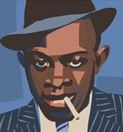
Wish I could put up the cover design I'm working on right now, but I can't. Hopefully I'll be able to reveal all in the next week or two. In the meantime here's something I did under the influence of red wine and sunshine in an attic in Salisbury in 1997. It was intended as a cover illustration for Flann O'Brien's the Third Policeman. I was reminded of the book the other day when watching the finale of that, almost distracting, BBC thing, Ashes to Ashes; both had a similar ending/reveal. Strangely enough, the approach I took for this illustration, sort of Picasso-esque, is representative of the story inside.

I'll try and put up something new next time.

Tuesday, 18 May 2010

Solipsistic, Norris, adaptions and the FA

This is one of those 'here's what I've been up to' posts. The top image is from the-thing-I-can't-talk-about-yet, not until it goes tits up or gets the final thumbs up from the publisher. The plan with this book is to scan the pencils and shift the levels rather than ink it. I know some people do this very effectively, so if any one has any tips I'm all ears.

I've also just finished a series of strips for the FA. I know I said I'd never draw another football strip after 6 years of doing football comics, but I needed the money and they asked nicely.

I completed the Lovecraft adaption I was writing and the script is winging it's way to the artist.
And this is my bread and butter these days - a weekly cartoon for Inside Soap magazine. This one is from a couple of weeks back and shows a switch to something a bit more design-y and atmospheric.

Next up I have four Horrible Histories covers and a comic strip about the TT, then I start work on a rather wonderful Doctor Who story by Jonny Morris I've just received which will appear in the Christmas edition of Doctor Who Monthly. After that I will be contributing a strip to Solipsistic Pop 3.


Solipsistic Pop 2 is available here. It's a beautifully produced book that smells wonderful and has a gorgeous cover by the very talented Luke Pearson. The whole thing is put together by another talented comic creator Tom Humberstone. The stories are intimate, funny and peculiar. The book introduced me to a number of talents I was shamefully unaware of like Stephen Collins, Kristyna Baczynski, Anna Saunders and Jack Noel plus others I'd heard of but hadn't read like Adam Cadwell and Marc Ellerby.
Contender for my favourite comic ever is Eightball by Dan Clowes and this collection reminded me of the joy there was to be found in Eightball.
Jumble Sales are Holy and Sweet Mystery were probably my favourite stories in Solipsistic Pop 2 - one features Freddie Mercury and his wolves and the other has people weeing on sweets - that's my kind of read.

Monday, 10 May 2010

Mum


Did this drawing of my brilliant Mum today. It's based on a photo of her when she was 17. A giant version of the photo used to sit in the window of Hartley's Photographers on Poole High Street in 1963, much to my Mum's embarrassment. From Hartley's the Photographers to Dinlos the blog, hopefully she won't be embarrassed by this version.

Saturday, 8 May 2010

Captain America


Something I fiddled with between jobs today. This is Captain America as seen in the early TV series rather than the Marvel comics version. I'm no expert on the superhero genre, and I doubt anyone will ever offer to let me draw a superhero story given that this is how I choose to see them.

Tuesday, 27 April 2010

Black and white Dredd


Think I might prefer the uncoloured version of this Dredd pic. Here it is, make your own mind up.

Monday, 26 April 2010

Judge Dredd

I was wondering aloud on Twitter why Dredd ended up with his squat bodybuilder physique today and that prompted me to want to draw the Judge again (the way I see him). It's been a long time, but I really enjoyed doing this. It's so imprinted on my brain. If Tharg happens to see this, now would be a good time to ask me draw Judge Dredd. Mind you, I'd imagine there's quite a queue.

Wednesday, 21 April 2010

Doctor Who meets The Beatles

Donna Noble (Catherine Tate) meets John Lennon with the Doctor looking nervously on.
Donna asks for John's autograph:
John: Is it for your daughter, missus?
Donna: No, it's for me mum y'cheeky sod!
Time travel gag. I wrote that. Well, I thought it was funny. Moving on.

These are some inks from the Doctor Who strip Time of My Life written by Jonny Morris. He's working on another script for me to draw right now which should appear at Christmas. This will be the 4th script by Jonny I've illustrated and I like to think we work together pretty well. Time of My Life featured the Doctor taking Donna to the Cavern club to see the early Beatles. This was probably the hardest page in the whole strip. (Click to enlarge!)

The Doctor drags Donna away from the pre-Ringo Beatles

And there's Pete Best on Drums. The Doctor and Donna are far right.

Comic art geek fact: all these inks were done with an Edding 1800 0.3 and 0.1. I used so much black in this strip it made it very difficult to colour. Actually I wanted the Beatles page to remain black and white.

After there visit to the Cavern Club the Doctor and Donna whizz off to some future dystopia populated by vampire goths.

This next story I'm doing for Doctor Who Magazine will be my 8th Doctor Who strip, I've written three and this will be the fifth I've drawn. It will be my first attempt at an 11th Doc strip. I'm looking forward to drawing Matt Smith, but I have to say I quite enjoyed drawing David Tennant. I always felt that he looked right as a comic character. In fact, the more 'realistic' the representation of him was the less it looked like him.

Last panel from Time of My Life.

Saturday, 17 April 2010

Old stuff

Can't put any new stuff on the blog at the moment due to the nature of the commissions I'm working on, so here's some more old stuff. This is from my time with the Inkshed agency. All three were from the period where I would draw freehand on the wacom into Illustrator with the pencil tool set to zero. It was less like drawing and more like cutting shapes out of coloured paper and pasting them together. I didn't really have a clue what I was doing and knowing when to stop was a real problem. The choppers pic was a promotion thing (I seemed to do more 'folio' work that actual paid work in those days). The chilli pic below was part of a calander I think. And the last one was for FHM magazine. I think it was to illustrate an article on race issues in US prisons. Well, that's what it look like.


Friday, 16 April 2010

SLANG part 2

Here's a page from SLANG issue 3. By the time we got to the third issue of SLANG in 1991 both Sean and I had developed our obsession with the 1970s into a complete approach to comics. You still see this in my Dinlos stuff today. Although there was nostalgia to what I was doing my thinking then as now was that the 1970s was a bit like a modern costume drama - a contemporary and yet strangely alien looking time that makes for a great setting. Something many films and TV series have realised since then. The Robbers was a bit uneven but reading it again I can see ideas I'm still interested in now; the power of the liminal spaces - the half seen, the misunderstood.

In other places the cultural references crept in too much (see the Ogron on the cover), but this was before the internet and just drawing things from another time gave them a kind of power. Now all of these images are at our fingertips and retro is so pervasive.

SLANG issue 4 never really happened, shot in the paddock, though I think we had planned to do an issue without my Dad on the cover. I was trying some madly ambitious stuff before being dragged kicking and screaming into the real world to draw comics for money. Below is an example - it's part of a page of music (yeah, I know). This is The Jam playing something from Setting Sons and/or Sound Affects by the looks of it.

And finally the ultimate synthesis of my obsession with 1970s culture was The Watermen, the story of three miniature Dennis Watermans who smoke fags and do 1970s stuff. It's very silly. I coloured it on a mate's computer in the mid 90s.


Thursday, 15 April 2010

SLANG 1989-1992


My cover for SLANG No.2. The kitchen sink scene painted on a canvas the cartoon characters and logo drawn on paper and glued on. This was the days before computers!

This may be a form of career suicide putting up artwork from 21 years ago, but here goes. SLANG is where it all began for me and my compadre Sean Longroft, we finally published our own comic after talking about it since we were kids. When we were kids we would have imagined our own comic as something full of sci fi guns and robots and all that gubbins; what we actually published reflected more about out lives as 20 yr olds and the only remnant of Sci Fi featured on the cover to Issue 1. There were no adventure or Sci Fi stories in Slang just the emotional outpourings of two drug-addled young men.

We got this cover screen printed at the printers where were doing our Employment Training in Boscombe. I rather enjoyed mixing up the colours, but as you can see screen printing isn't the easiest way of putting colours on a comic book cover.

One furious reader in Oxford returned his copy of No.1 to Comics Showcase on the grounds that there was nothing like the 2000ad-ish stuff on the cover inside. There wasn't. The whole thing was an LSD-drenched journey through mundane suburbia.

Derek was a proper 'does what is says on the tin' style comic character.

Most of what we did was heavily autobiographical (I mean, christ! my Dad was our cover star!). Issue 2 featured my musings on my errant teens and my parents collapse into mutual, general and self destruction. The whole thing was filtered through a psychedelic looking glass and was completely incomprehensible to most readers.

Our protagonist is haunted by the place that used to be home.

Dad in his pants in the garden at night.

Again a sense of being haunted by home.

We had no idea what to do with it once we'd printed it (we printed 1000 copies of Issue 2), we weren't really aware of other independent comics at the time and didn't have a clue about distribution. We managed to part fund it by hand drawing advertisments for local record shops, comic shops and head shops. Copies found their way to the strangest places, some even made it to the US. A friend of mine took copies over and gave them to a comic shop, he asked the the shop owner if there was anything like it in the states that they could give him in exchange and he was given a copy of Eightball issue 5. Needless to say we were blown away by it.

We ran out of money before we could print more than a couple of copies of Issue 3 (I'll stick a couple of pieces from that up at some point). One of the few decent things the Tories ever did was the Enterprise Allowance Scheme which enabled us to get the first two issues out, when that came to an end we were back on the dole. Until, that is, Stuart Green and Frank Plowright got a copy and offered us work on their new football comic Glory Glory.

Finally here's a delightful little strip from issue 2 by Sean, he'll hate me for putting this up but he is taking this piss out of me in it. Actually Sean's drawing is much more together than mine. Like I said career suicide, I'm not even the best artist in the thing!

Tuesday, 6 April 2010

The Ratcatcher


Here's a screen shot of the job I'm working on at the moment. Can't say much about the project as it's in early stages, but it's something suitably gruesome for the kiddies. I guess this is sort of how Horrible Histories would look if my style consumed Martin's. I'm particularly fond of the dog in this picture.
 
Site Meter