Wednesday, 24 September 2008

Revenge of the Masterplans

I've had to remove these images and connected blog.


I'm having a break from Doctor Who now so I can earn some money. I think I'm in line to draw a strip next year and I may write another one at some point, but for now my Doctor Who magazine work will be limited to doing the spot illustrations for the audio preview page.

Tuesday, 16 September 2008

I am a Dinlo


Had a bit of a disaster yesterday - it seems I accidentally saved my lo res crop of the Kackernory titles over the file containing the whole page of artwork. As a result I lost a whole page of finished artwork... forever. With stiff upper lip and socks pulled up to my hips I spent the evening redrawing the tile panel. It gave me the chance to fix a few things and add a few things. I've replaced the horrid comic sans lettering with one of Mr Langridge's lovely fonts (thanks, Roger) and I've fiddled about with the title so it stands off the page a bit better.

Actually, I just dropped a grey cut out of my titles onto the page and that's where it landed. I left it there. It made me think of carnies and river gypsies, which, given that the story is about a Gypsy family, is perfect. In fact it has a daubed look that I remember from my own Grandfather's decorations on his wagon. He never did any lettering because he couldn't read or write, but he painted flowers and spirals onto everything in that classic Victorian fairground style. Victory snatched from the jaws of defeat.  

Saturday, 13 September 2008

Dinlos are GO!!!

Our time traveling hero flees his emotionally disturbed step-dad 

Some Romany jib from Grandad

Pearl, her mum and Roy from the grocers.

Well, not quite "GO!!!", but at least there's some panels from Dinlos and Skilldos on here now. I'm so busy with Murderous Maths and Horrible Histories that I haven't got time for my delinquent characters. So until I get time to finish a few pages I'm putting up these title panels. 

I've procrastinated to such a degree over this project it's miracle these pictures haven't had all the life sucked out of them. The original plan for this was fairly simple: I wanted to write about childhood in a medium that was capable of doing it believably without turning it into a collection of wise author's memories, either the fondly remembered or haunting nightmarish variety, and neither did I want to go down the Blue Remembered Hills or Paddy Clark Ha Ha road of mimicking childhood for effect. To me the solution was to write a novel inside a Whizzer and Chips Annual!

Hey! I happen to think it's a good idea! Obviously, the only way I can demonstrate it's good idea is to actually do it - I've written some fantastic novels, screenplays and comics that have never made it further than the triangular fossas of my beer-addled chums. Of course drawing and writing 144 pages is a big ask and finding the money to publish a hardback of such a book is highly unlikely. So the plan is to self publish it in six issues and see if I can get it put together in a book some point in the future. Two of my addled chums, Nod and Beth, have offered to put up some money and all I need now is the time and application to get it done.

Back to these title panels - they look a bit scruffy. That's partly intentional, I want this to feel grubby, and also it's because I'm not Roger Langridge or Chris Ware, and I can't do that brilliantly integrated period typography thing that they do. I've kept as much of the spring-loaded Whizzer and Chips feel as I could (after all that's why I'm doing it in this format and style) but I've recently added a half tone element to give it extra atmosphere. I wanted to steer away from horrible painterly modeling or too much digital whizz-kiddery, so I've scanned some of my 4 year old daughter's paintings and been using them like a kind of letratone. 

I won't go into the stories themselves yet because I'm a firm believer that the more you talk about an idea before it's done the more you suck the life out of it. Hence most of my ideas are like dried fruit.

Tuesday, 9 September 2008

The Devil in the detail


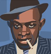
This is another cod image. I think all illustrators enjoy producing fake covers for books or records or films they love. Personally, I like anything that alludes to a narrative, I love making little theatres out of  these things (as with the Love cover below). 

Robert Johnson is the guy who sang about meeting the Devil at the crossroads and being pursued by Hellhounds back in the 1930s. As with the Love thing I'd love to work on a semi-fictional version of his life where there are real Hellhounds on his tail and where he makes that Faustian pact with the Devil. (I'm not saying he didn't btw). Griel marcus and Robert Palmer have both bought into the mythology in their writing about Johnson and there's so much mystery around Robert Johnson's life it's hard not to get swallowed up in the legend.

I don't know precisely what it was that I was trying to ape in this mock LP cover. I guess there's a mixture of those primitive printing techniques from the early part of the 20th century and the cartoon representations of black people from the same period. Black people only appeared on products related to slavery and service during very early years. (see the image below)


And if it wasn't as slaves it was as savages that black people were depicted - running about the savannah with the lions. Again, it was the cartoonist/illustrator's  job to make these images come to life and plant those seeds (see snakes and ladders below).


The black man it seemed had to be depicted as terrified and that image from illustrations is mirrored by the plates-for-eyes faces of comedic terror you see in early cinema roles for black people. Perhaps it's no coincidence then that the same images occur on the real artwork for the Blues records of that time.


Dunno where that leaves me in trying to work out what I was thinking when I set out to do that mock LP cover. Those early illustrators were clearly part of an agenda in their portrayals of black people. Funnily enough I've found myself victim to the reverse agenda as an illustrator. I'm all in favour of "PC", but found it odd how often I was asked to make my black people look more caucasian for fear of causing offense (To whom???).

 I guess all of that period stuff is in there on some subliminal level on my mock LP cover. You certainly see something of the agape face and white eyes on Johnson in my picture, but I'd like to think it's more double take than comic terror. He's certainly standing toe to toe with the Devil rather than cowering - he's here to meet with the Devil not about to run.
 

A portrait of Robert Johnson I did for the Inkshed brochure 2004

(I must give a mention to Ian Culbard's blog because I nicked the idea of scanning old books and comics and lifting the battered edges off to give a fake aged look to digital stuff from him. You can see the effect on the Love cover and the Robert Johnson portrait. The mock LP cover actually does look that battered, it was painted on a canvas board then sanded down and kicked around the yard.)

Arthur Lee and Me

Johnny Echols and Ken Forssi on the cover of the Love comic

It was my ambition for a while to write a semi-fictional biography of Arthur Lee and his piebald psychedelicates - Love. For many years these one time inhabitants of Bela Lugosi's castle existed beyond factual history in a kind of dark mythos. The torch wielding mob had passed around rumours and the only people listening were fried. The only truth was to be found on the records and Arthur sounded like he might just have the truth

I discovered Love in the late Eighties and the only information I could find about them was in their lyrics and the pictures on the record sleeves (remember those days?). I found an article about them in a self published magazine called Freak Beat by a guy called Bissmire. This is where the strange image I already had of black psychedelic singers and mariachi bands and ruined castles and people painted brown living on the moon got weirder with tales of murder and band members robbing doughnut stands. Mr Bissmire sent me everything he had on the band and I set about filling in the blanks...

In my mind the story was like a spaghetti western with the paranoid musicians holed up in a ruined castle - Lee with hair straighteners in, chickens and semi naked people everywhere, Johnny Echols watching the windows with a shotgun, so I wrote it as a semi fictional account. Later, in the 90s that became a comic book idea. I just felt I wanted to fill in some of the gaps. I notice Richard Dawkins has recently claimed that gaps in knowledge are a refuge for woolly thinkers and fantasists, personally I think that the God of the gaps is the imagination and without it there would be no art or science.

Anyway that was then... things changed for the better for the lost souls of Love. They reformed, started gigging, got all the credit they had deserved for so long and hopefully got a piece of happiness. Also the real story of Love emerged, proper books were published and now there's even a film. The band have come out of that dark web of myths and obscurity and into the light. They deserve it!

When I dug out these couple of images the other day I did wonder what the point of them or the project was now. I guess they're just a reminder of a time before the information age when the gaps we were left to fill were in some cases total chasms.


Pencils for a panel of Johnny Echols and Arthur Lee 

There's a promo for the Love film here.  I'll be getting the DVD and finally getting to find out what went on. Can't wait! 

(23/09/08) I have the DVD now, the director was kind enough to send me a feebie in return for use of the Love comic cover image. I think he's had it framed for his wall. He also told me that he and Arthur Lee walked along the strip where the Donut Stand was and Arthur mentioned something about the legendary bandit days of his guitarists, but refused to elaborate any further. Some things are best left as rumour and myth.

Sunday, 7 September 2008

Michael Charlton 1923-2008


The Fianna from The High Deeds of Finn MacCool illustrated by Michael Charlton 1967

Mike Charlton is one of my favourite artists, he was also my friend, my best mate's Grandfather, my landlord for six years and (as he was fond of telling me) my mentor. For the sake of this blog I'm going to focus on Mike the artist, because you don't need to have loved him as a man to love his art. He's not as well known as some of his contemporaries and given how modest and unpretentious he was about his art that isn't surprising, but other artists really should look at his work.  

I'll hopefully write more about Mike's work in the future, for now though I've scanned some of his work from The High Deeds of Finn MacCool - I have two originals from this book in my collection so you can compare the printed image with the drawn image. And this book features some of his best work - work that reflects his personal vision.

Finn and Niamh
 
There were a number of illustrators producing beautiful free line illustrations in books during the 1960s. Freed from the constraints of hatching madly away in an attempt at 'realistic representation' illustrators took to using more abstract approaches. And it wasn't just children's books that had illustrations in the 60s, the inky textures of the illustrations sat happily on the same plate as the type and it seemed perfectly natural for the text to catch its breath every once in a while as the illustrator took over. There's an art though to filling those spaces in the text, perfectly exemplified by Mike's illustrations in Rosemary Sutcliff's High Deeds.  In fact these illustrations are even making my blog look rather lovely!

The Hounds from the High Deeds of Finn MacCool

The art to filling those spaces is to illuminate the text without casting a shadow over it, to illustrate what's happening without distracting the reader with your personal vision. This is where Mike's modesty and lack of pretension give him an edge in my view. His illustration tends to be sympathetic to the text and to the page,  never looking to compete for attention. He doesn't have Victor Ambrus's quirky characters or Charles Keeping's bold experimentation and perhaps it's for this reason his work didn't garner more attention and praise. It doesn't jump up and down demanding attention.

The Battle of Gavra

In the Battle of Gavra image you can see Mike soaking up the influence of stablemate Charles Keeping. He's trying out some of those forced almost geometric shapes that underpin Keeping's style. He's also sculpting the ink splashes with brush and pen. It's totally sympathetic to the subject matter and it's probably no coincidence that Keeping himself found his identity illustrating Rosemary Sutcliff (1957's The Silver Branch). It was great subject matter for artists of that generation who themselves were raised on tales of high adventure and derring-do.
 
Finn battles the Aillen of the Flaming Breath

In the Aillen picture though you can see Mike's natural figure drawing ability breaking through. I can honestly say that I don't think I've seen anyone with more natural drawing ability than Mike, it shines through even when he's trying to obscure it or uglyfy it. Mike may not have had some of the stylish quirks or experimental tendencies of some of his contemporaries (I think he secretly thought such things were just showing off and not for him), but those contemporaries could only look on with envy at his gift for drawing.

Mike once told me that his vision - his idea of the perfect illustration - would be a single line that looked so natural, so unforced, that it could just as easily be a spill from an ink bottle or a stream of smoke. But within that line he imagined an entire army laying siege to a craggy castle. It would be an image so unassuming that it concealed its beauty by appearing to be an accidental blemish. And yet when the viewer chose to focus on it they could discern all the information: the battered helmets, chipped swords, split shields, rocks, crumbling walls and all the emotion: the bleakness of the day, the striving of the army, the bucking of scared horses and the shouts of the men. It's a wonderful idea and it will remain stuck in my head forever.

It was in the early 90s that he told me about this vision and it was back in the late 60s that the vision came to him. Well, I happen to think that he came pretty close to that vision in this book and others from that period. He wasn't trying to show you how clever he was, he was trying to make illustration so incidental and natural that it belonged in the text. When I see editions of books like Finn MacCool, or Hiawatha without Mike's illustrations they look naked and incomplete. You can't pay an illustrator higher praise than that.

There's an obituary and list of published books here at Bear Alley.

Saturday, 6 September 2008

Doctor Who comic strips

Scene from the Immortal Emperor - Doctor Who Storybook 2009

I spent a large chunk of this year working on Doctor Who comic strips - I've been writing for the Doctor Who magazine strip since 2006. I wrote The Woman Who Sold the World illustrated by Mike Collins, Bus Stop Illustrated by John Ross and The Widow's Curse illustrated by Martin Geraghty. Between April and July though I switched hats from writer to artist and drew two Jonathan Morris stories, The Immortal Emperor (for the 2009 Storybook) and The Time of My Life (for Doctor Who Magazine 399). 

The Immortal Emperor was my first go at drawing a comic strip in a couple of years, I felt rusty as hell and, because I had no idea how it was likely to come out, it was a real hair-raiser. Luckily the story was packed with great ideas (packed being the operative word - Johnny seemed to have written a 4 part story and then condensed it into just 8 pages!) It's full of Fu Manchu and steampunk imagery, perfect backdrop for a Doctor Who comic strip!  

The Emperor's throne room

The scene above includes some Chinese mask designs that I used on the walls. I got the designs from an old book lent to me by the kind patrons of the Dorset Bookshop in Blandford Forum. The Emperor looks very Mike McMahon-ish, this is something that used to depress me about my comic stuff - the thought of always being in the shadow of the master. Doesn't worry me now, you can't hide your influences and Mike (now Mick) is one of the biggest influences on my career, stretching back to the late 70s early 80s when I copied his 2000ad work as a kid. He's one of my favourite Mikes and probably still my favourite artist.

The next strip turned out to be a real headache. Written as a epilogue to Journey's End, The Time of My Life features 9 separate Doctor Who stories in the space of 10 pages! Here's a few images from the strip:

Gentrified hunting dogs seeking world domination in an inverted flying house


Cossacks caught in laser fire


The Android Miss Havisham awakes from her sleep

Great ideas again from Mr Morris, but I probably worked too hard on the inks and ended up with a number of the pages looking like they didn't want colouring (see the Miss Havisham page above). This shows my rustiness and lack of confidence. Fortunately I was able to work hand in hand on the colouring with Geri (Geraint) Ford and rescue most of the pages.  

I drew each page as a 'super panel' concept to keep the feel of a different adventure/different world to each page. Most of my pencilling these days is done on the wacom (I will occasionally go back to an HB and layout pad if I feel the lines are all getting a bit too cosy), I then print out the 'pencils' and ink on a light box. My inks are done as quickly as I can with a scratchy Edding 1800 size 01. I try to draw quick shapes for all the shadows with the fine pen and don't do any black fills with ink. I scan in the skeleton inks as bitmap into photoshop and then tidy up and paint bucket fill the shadows. This means I still get shocks and surprises with how things turn out, something that I find essential for retaining my hunger for the job (I get easily bored). If things don't work (there are some shocks and surprises that aren't welcome) I just start working freehand onto the page with a black or white pencil tool.

The Inverted Coma


This is another project that needs finishing. I intended it as a sample strip for 2000ad in an attempt to get some comic strip work last year. This is one of the few finished panels (yes, the people in the bar are supposed to be all in black and white). It needs a few changes before I'm totally happy with it.

I've been so busy since I started on it that I never got round to finishing it. I work full time as an illustrator and writer, but I usually still make time to work on my own projects. This year I've been doing some comic strip work, writing and illustrating Doctor Who strips, (more of that in a moment) and it's taken so much of my time that I've let a lot of my own projects slip.

WTF is Dinlos and Skilldos?!


I'll be using this blog as an attempt to shame myself into completing some of my ongoing projects and also to give me opportunity to wax lyrical about things I love. The blog is named after my biggest ongoing project a... (nope, sorry I hate the term Graphic Novel, it's not a Graphic Novel!) Dinlos and Skilldos is a big story with lots of characters told as a comic strip because that is the only medium capable of telling it the way I want it told.

Etymology: Dinlo (or dinilo) is the Romany word for fool or idiot and was much in use in the playground when i was a kid; Skilldo is pure playground argot. Evil Knievel was a Skilldo, the kid who wore his shoes on the wrong feet was a Dinlo. Easy.

Anyway, this image (above) is one of the numerous aborted cover ideas I've had for Dinlos. This one, as my friend Sean Longcroft pointed out, is just too nice (despite the fact it features children smoking!). It's just a rough done in photoshop. I nicked the design from a 1968 road saftey book, so it's the wrong period as well. Dinlos is set in the mid to late 70s. 
 
Site Meter